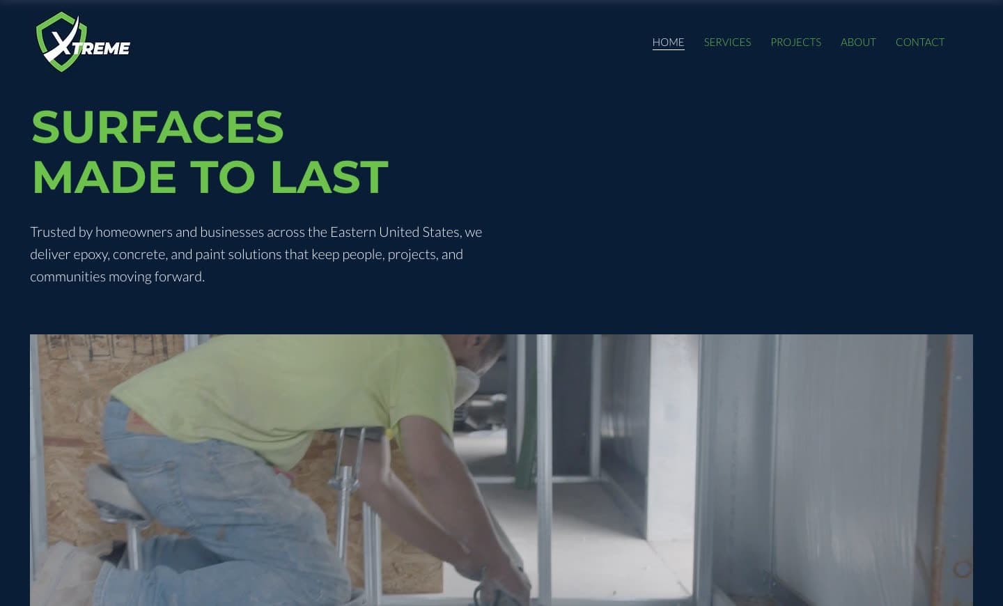
After · new system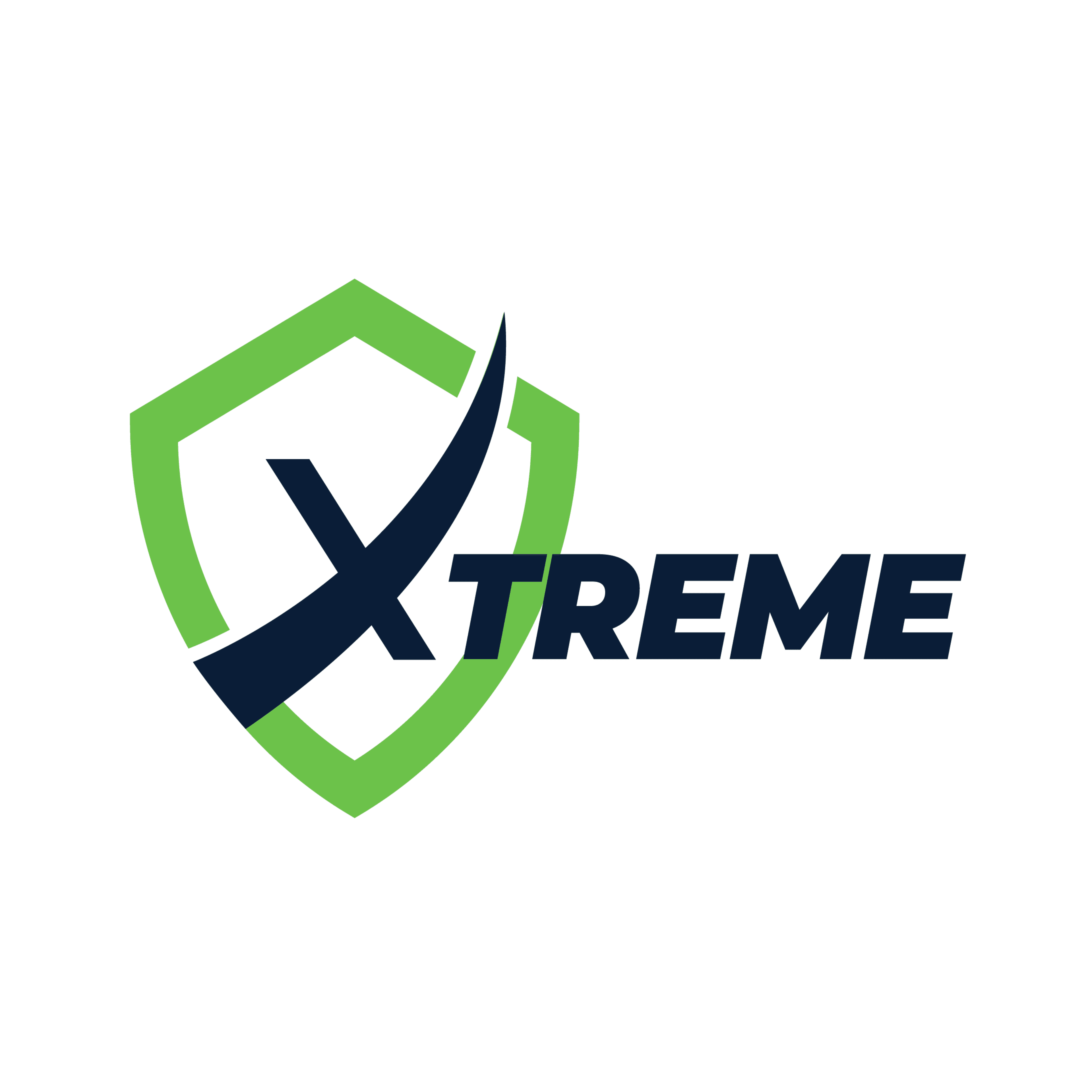
Before · old system
01 · Logo system
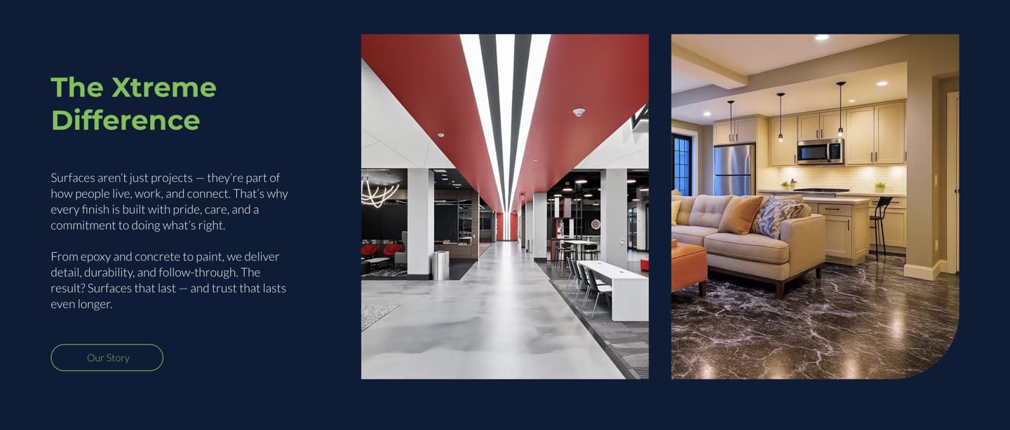
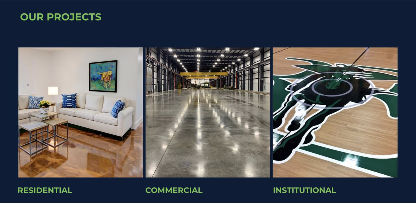
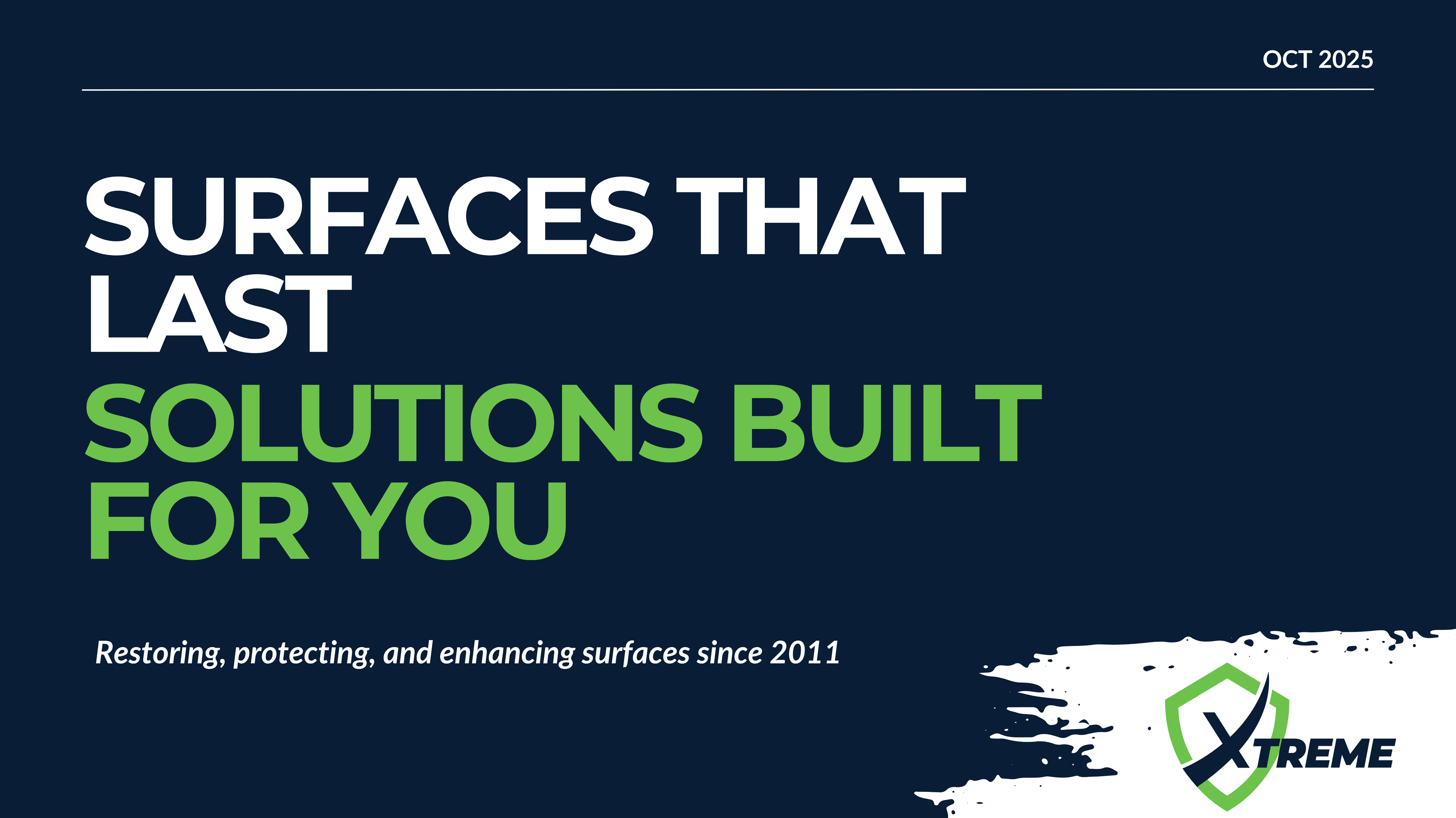
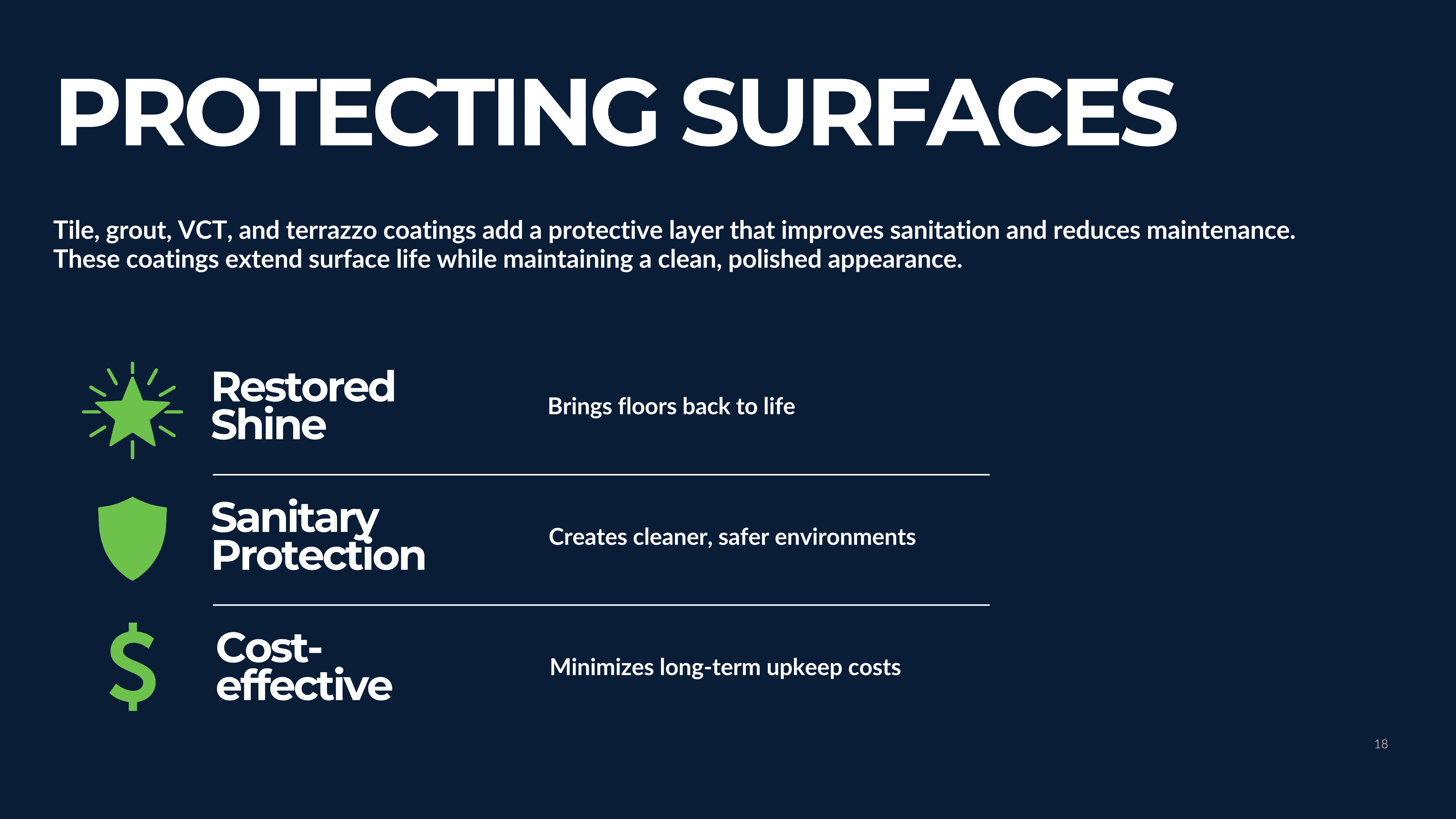
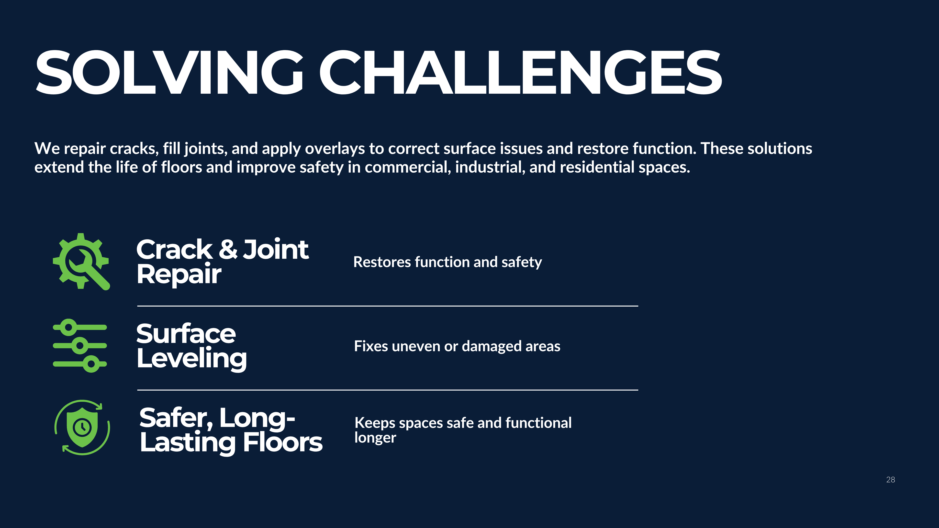
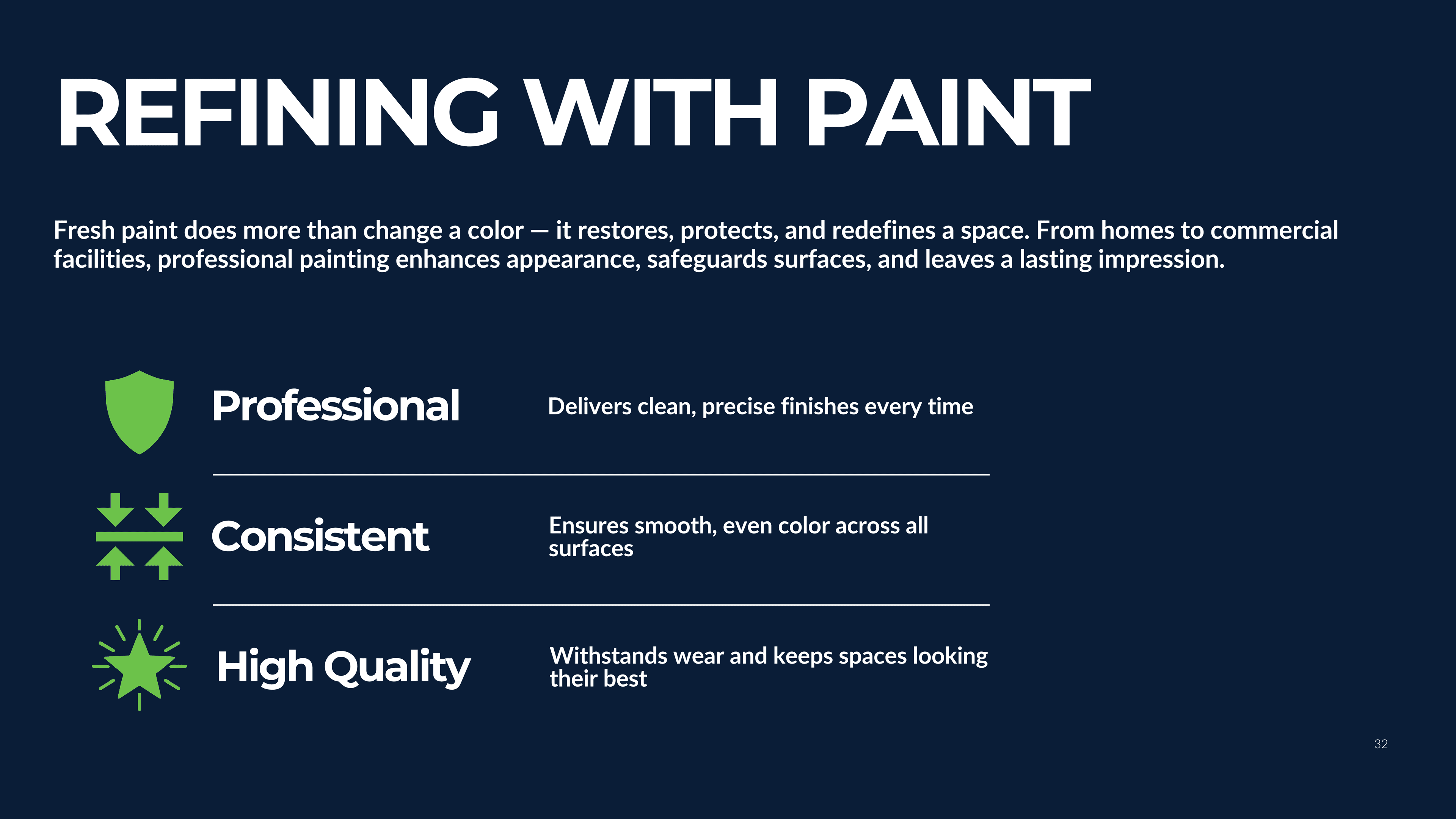
Industrial brands default to one of two failure modes — generic trade logo or overdesigned attempt to look “premium.” Xtreme had the first version of that problem: a glossy shield with a handwritten wordmark that looked like every coatings logo from 2008. The brief wasn’t to start over — it was to keep what was working (the shield silhouette, the green-and-navy anchor, two decades of jobsite reputation) and rebuild everything else. Refined shield, bold sans-serif wordmark, an icon-only mark for vehicle and uniform applications. Same brand DNA, dragged into the present without losing what got Xtreme this far.